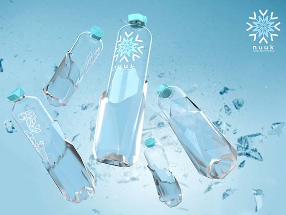
Nuuk

The NUUK brand takes its name from Greenland’s capital and the fjords that make it famous. The “Frozen, Authentic, Unique” slogan highlights the brand’s attributes, which are closely linked to the properties of water. Produced from clear, 100% recycled PET (rPET), NUUK is a container designed for high-quality, fjord-sourced premium water brands.

With its pure, sophisticated and distinctive design, the 500 ml bottle showcases the water it contains and reflects the brand’s essence. Thanks to its asymmetric shape, NUUK stands out on the shelves, putting traditional water bottle designs in the shadows.

With more than 20 years of expertise in creative PET packaging design, Sidel brings any idea to life. The company’s artistic designers work together with beverage and food industry players to understand their businesses and to ensure full consistency across different brand components from brand identity to industrial bottle production.

Get more information on Sidel training

An authentic frozen bottle arising from the ice

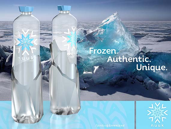
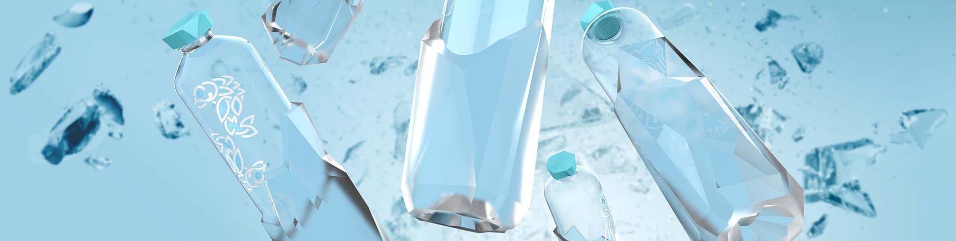
The NUUK PET 500 ml water packaging concept is inspired by the purity of ice and its formations. 

  • The specific ice shape on the lower part of the bottle constitutes a great asset and reinforces its structure. It gives the impression that the bottle is surging up from the ice.  
  • In line with its origins, the deep bottle base resembles a rock glacier and is produced by Sidel’s patented Base Over Stroke System (BOSS). The mechanical forming which takes place during the blowing process optimises the material distribution in the final bottle base profile.
  • The wide cap, with its ice shape and blue colour, enhances the brand’s premium look and perception.
  • From the base to the bottle cap, the harmonious shape is accentuated by a transparent and cleanly designed label. The purity of the water can be clearly seen through the elegant and minimal typography, thus emphasising the bottle’s appearance.

The equilibrium of the planet and life on Earth

From water purity to recycled PET, Sidel designers always keep in mind how to protect the planet when thinking about creative packaging design solutions.

  • The bottle is compatible with tethered cap solutions to meet environmental requirements and forthcoming regulations.
  • In addition to the water quality and integrity symbolized by the fjords, the use of 100% rPET goes hand in hand with Sidel’s sustainable commitment to achieve closed-loop, food-grade and recyclable plastic packaging.

Geometric Viking art influences label design

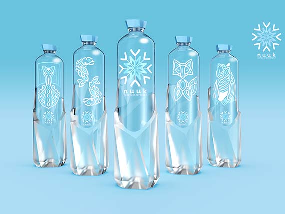
The transparent Pressure-Sensitive Label (PSL) decoration is inspired by authentic Viking art, more specifically the Borre style. In the 10th century, the Nuuk area was inhabited by Vikings who left their cultural imprint, including their art.

  • The Borre style embraces a range of geometric interlacing, knot patterns and zoomorphic (single animal) motifs.
  • Five versions of the label show different graphic designs based on this geometric interlacing.
  • The brand logo is a snowflake combined with an ancient Norse symbol, Vegvisir, a symbol of protection and guidance believed to be used as a compass by Vikings.
  • The other labels represent important symbols of Viking culture, including the traditional ship, two head-to-tail fishes, the artic fox and the polar bear. Consumers can collect each bottle from this unique family.
Sidel Group has updated its Privacy Notice
Ok, I understand